Hey there everyone,
First, I wanted to say thank you to the people who supported us and the release of the Harmonious Prelude update for Blade Symphony. It was a stressful, albeit fun, week of last minute testing and patching. We’re very fortunate to have had the turnout we did, and are happy the update is finally out. Before I delve into the the release of Patch 1, I want to address a few topics. These are things that I really should have provided more clear information on prior to release, but I got caught up in the work leading up to the release.
What the Harmonious Prelude was and wasn’t.
Back in March, I made a news post discussing the Future of Free-To-Play. Under the Release section, I made it clear that we would first be releasing a large update, Harmonious Prelude. I tried to make it clear in Discord and in news posts, that this was the predecessor to Blade Symphony going Free-To-Play. I apologize if I wasn’t clear enough.
Here’s why we did Harmonious Prelude:
- Prior to this update, the workload required to create models, textures, and load them into the game was not conducive for adding lots of content. As we know, a Free-To-Play title has to have lots of free and purchased content to be successful, and a variety of options for players. As a result, it must have a pretty fantastic pipeline for artists and developers to add this content.
- Additionally, we were using our own item service which was a massive headache to work with, as it was very old. We switched over to using Steam’s Inventory Service, which meant a ground-up rebuild of how we handled items.
- We also had a poor build and deployment system, by modern standards, which meant we couldn’t rapidly release builds as much as we wanted to. The benefit to this meant that we could also create a build pipeline conducive for more platforms, which is why we have Mac and Linux.
The feeling was, and still is, that with a big update and a price reduction from $4.99 to $0.99, that this would feel like a good bargain for new players. However, some still feel like it’s not good enough for current players. Which leads me into:
What is going on with the Item Store
Free-To-Play games just get more players. Period. Lower barrier of entry, means more people downloading and trying. However, in order to sustain a Free-To-Play game, that went from making little money to no money, the developers have to sell something. Since Steam doesn’t offer a micro-currency system, we had to get rid of the in-game notes currency (RIP.) However, it meant that we could use the Steam Inventory Service to sell items we felt were premium. Upon launch, we went live with four items on the Item Store.
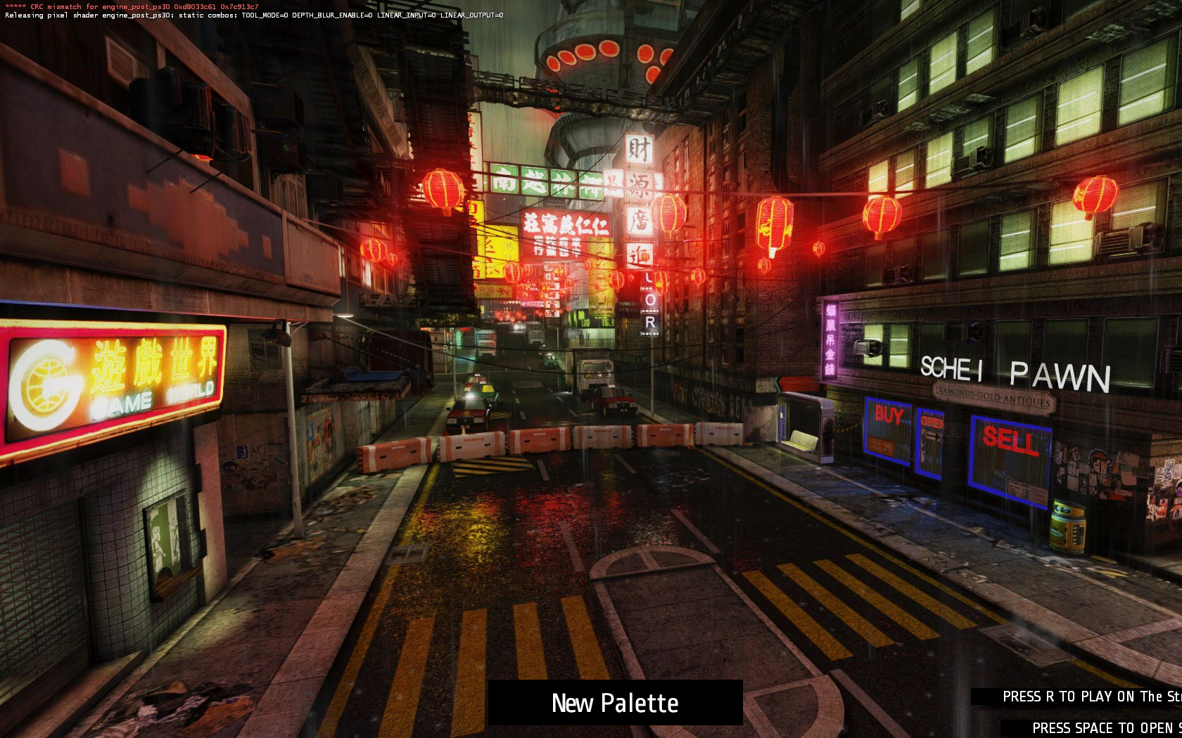
Unfortunately, these were already items that were available for players prior to the Harmonious Prelude update. The long-term plan was for a variation of these items to be available on the item store, but they were not completed in time. For example, a variation of the Ryoku Kabuki mask will be available on the Item Store. Here’s what it looks like so far:

When the new variations for Ryoku’s Kabuki Mask, Resonant Phase, Flame Song and Cardboard Tube are complete, then these variations will appear for anyone who purchased them. The original variations will be put back into the game as items freely available to unlock. As much work as we could to improve the pipeline for new content, I didn’t expect that many of our old models and source files would be in a bad state. Many of them need to be re-made from scratch, or we don’t have the original assets for. My hope is that we can get all of these items complete within the next two weeks.
Workshop changes, and returning to normalcy
Many people are understandably frustrated with the lack of ability to use the Steam Workshop like it was prior to the Harmonious Prelude. Please do not fret, it will be like the old days soon. There are two types of Steam Workshops: Subscription-based and Voting-based.
Prior to Harmonious Prelude, Blade Symphony had a Subscription-based workshop. This meant that, anyone could subscribe to an item, and they would have it until they unsubscribed. The downside to this, was that authors could not sell their work if they wanted to. For a Free-To-Play game, it wouldn’t make sense not to allow authors to charge. After all, anyone who does work on the game, should be paid. It will help support Blade Symphony longer term.
Now, Blade Symphony has a Voting-based workshop, similar to Rust or Team Fortress 2. This means that the community must vote for an item to get implemented into the game. Once it is approved, the developers work with the Workshop Author to implement it, and it is released with a new game update. However, the downside is, that we’re not able to offer items for free (apologies if I said otherwise, I was misinformed.) Even if we could offer items for free, it would severely screw up the economy by having free items that are marketable floating around.
Our answer to this, is to integrate it directly into the level-progression system. So now, if an item gets voted up, the author will work with the developers to add it so that anyone can unlock it based on their level. We’ll also offer the chance for items to unlock as a playtime reward (x items per week for playing,) but that’s new, so more on that later.
In summation, in order to allow Workshop Authors to sell their content (if they wish,) we needed to move over to a more flexible Workshop type. Once Valve gets back to us on approving items, I will be working with authors to implement their items, and hopefully you can wear construction cones and television sets on your head once more.
What’s happening now
There’s been some bumps in the road. However, we’re committed to this game for the foreseeable future, and Free-To-Play is still in the cards. Since we’re not dealing with a completely different Steam App (The Blade Symphony Beta,) we’re going to be releasing weekly updates. My hope is to release a patch every Monday that represents the last week of work.
As far as what we’re tackling? Right now, it’s not very clear. We have a good amount of bugs and small fixes that we know we want to get in, that either were too low priority to get in with the Harmonious Prelude patch, or things that we only discovered once the patch came out.
After that’s done, we’ve merged in Valve’s new Panorama code, which will make creating and modifying menus (something we need to be better at, prior to becoming a Free-To-Play title) much easier. Additionally, we’re having conversation about doing further changes to the content pipeline so that our artists can create new content directly from their modeling and texturing program of choice. Additionally, we’re eyeing some game modes for integration, and a potential new platform.
Patch 1 Release
On to the exciting stuff! After about three weeks of taking a break, and doing a lot of necessary back-end work, we put time into fixes and updates last week. We’ve released Patch 1 and are already hard at work on a Patch 2 release for next Monday.
Changes since Release Candidate 4
Changes
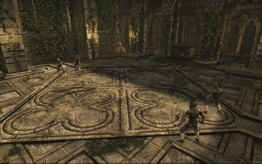
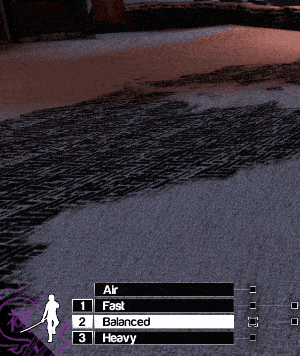
- Added Style Selection button when in the Free-For-All (FFA) game mode. This can be accessed by holding the Tab button.
- The challenged player will be forced to play using the Style of the challenger for the duration of the duel. After the duel, the Style of the challenged player will return to what it was prior to the duel.
- When not in a duel, the symbol representing the Style that a potential private challenge opponent is currently in will show below their name.
- Bots will now automatically accept challenges in FFA.
- XP can now be gained from private FFA duels.
- Added convar bb_queue_bot_discrimination. When set to 1, bots will not immediately leave a match when a player joins it.
- Added Italian Translation! Thanks Alixey!
- Updated French, Dutch, German, Hungarian, Korean and Japanese translations.
Fixes
- The map now no longer immediately changes if players voted to change the map. The server will wait for all duels to end.
- Shurikens damage players in FFA properly, regardless of the player being in a private duel. Shurikens do not lock on when not in a private duel.
- Ragdolls should no longer be drawn if the player is a spectator
- Players can again suicide while in Control Point or Free-For-All mode, unless during a cut scene or intermission in a private FFA duel.
- Reverted earlier attempts at misguided lag compensation. This should address some issues high-latency players are seeing.
- Bots should no longer go between ready and unready states at inopportune times.
- Made changes to the slowdown to hopefully correct it occurring at the wrong time. Unfortunately, for now, we have to reduce the time the slowdown occurs for.
Known Issues
- Queuing to a match still does not perform correctly if there are more than 2 players queued in a single match.
- Ragdolls from other matches are being showing in the player’s arena, but should disappear when they are despawned.
- Players bodies are disappearing when they ragdoll in Free-For-All.